Atheneum Sentiment Colors
New OKLCH-based sentiment ramps for Atheneum, giving components more flexible color usage while holding accessible contrast while steering clear of brand accent hues across 5 brand themes.
Impact
Key Outcomes
- Built sentiment color ramps on OKLCH for perceptually consistent steps across the full range
- Met accessible contrast targets by construction, not after-the-fact correction
- Gave components a wider range of sentiment colors, with interaction states and higher and lower contrast options
- Designed the sentiment hues to steer clear of brand accents across all 5 Atheneum themes
Context & Constraints
Before this work, Atheneum's sentiment color system relied on a rigid 6-token setup: a single base color paired with a single "highlight" variant for warning (red), info (blue), and positive (green). Without full color ramps, components recycled these few tokens across different states; warning tokens doubled for both caution and critical alert patterns, relying merely on inverted border and background roles to signal severity. The original hex-picked values lacked a systematic foundation, and a caution hue (yellow/orange) was intentionally omitted to prevent visual overlap with the primary brand's gold accent.
As part of a broader system initiative to expand all color palettes into 10-step ramps and accommodate an expansion to 5 distinct brand themes, an audit revealed hue collisions between existing sentiment tokens and emerging brand accents. My focus was to construct dedicated, 10-step sentiment ramps and safely introduce a distinct caution hue without compromising brand identity or theme integrity.
Core Constraint
Strictly meeting WCAG 2.1 accessibility standards, while proactively designing for APCA contrast, across all 5 brand themes, all without creating hue collisions or negative brand associations between caution/warning states and brand accent colors.
Problem
- Rigid Token Structure: Relying on only 3 primary sentiment colors paired with 3 single "highlight" variants failed to support complex UI states across 5 distinct brand themes, dark mode, and multi-layered surface component patterns.
- Hue Collisions & Brand Risk: Without dedicated hue bands, existing sentiment tokens clashed with emerging multi-brand accent colors, risking negative brand association if warning or caution states looked indistinguishable from primary brand accents.
- Designer Workarounds & Fragmented Systems: Constrained by the missing 10-step ramps and lack of a true caution hue, designers began pulling external palettes from libraries like MUI and Tailwind, creating fragmented implementation and inconsistent component governance across product teams.
Approach
OKLCH & Sentiment Scale Architecture
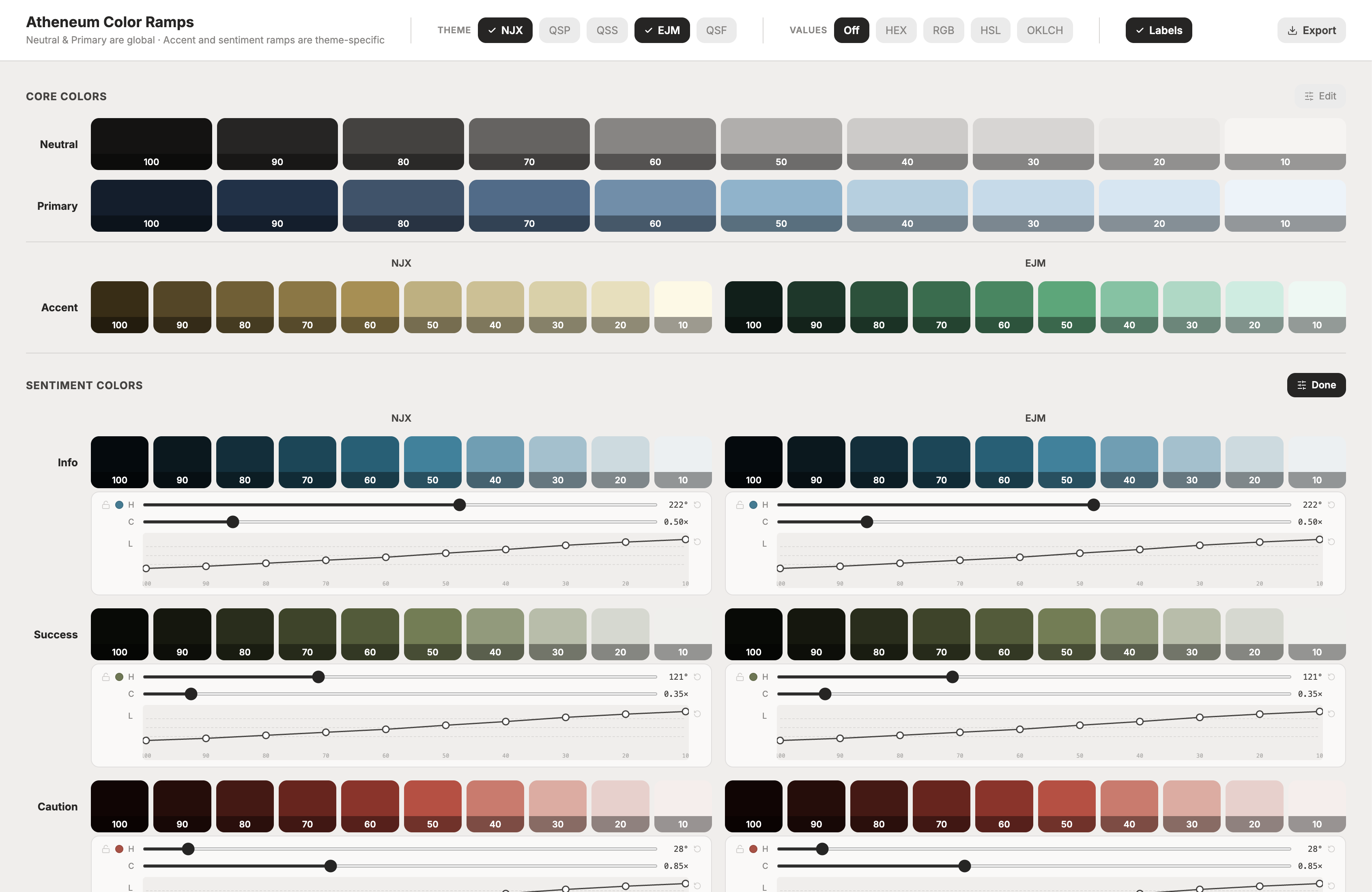
To eliminate perceptual lightness jumps, I moved palette generation to OKLCH. I expanded the existing blue, green, and red sentiment colors into 10-step ramps (info, success, and error), added a dedicated caution hue (orange), and aligned lightness steps and chroma curve shapes across all four. That builds contrast rules into the step pairings: a 20 step surface with 60 step borders and icons and 80 step text guarantees accessible contrast on any sentiment ramp.
Accessibility & Perceptual Considerations
I validated contrast with the Stark plugin in Figma, checking WCAG 2.1 and APCA for text and icons across Atheneum's surface set: the primary and neutral base surfaces and the overview, primary, and secondary task backgrounds, in light and dark. After some early step adjustments, everything passed.
OKLCH also fixed a perceptual problem in the old hex-picked values. Side by side in components, the previous positive color drifted toward olive and sat close to the gold of the "Special" badge, and the sentiment surface tints looked uneven in weight. With shared lightness steps, alerts at the same step now carry the same visual weight, so severity comes from hue and treatment rather than one color being louder than another.
Expanded Component Range
Full ramps let me go beyond recoloring. I created dark-mode variants of the components that use sentiment colors, an optional inverse variant for brands with darker surfaces, variables for interaction states, and higher and lower contrast options for icons and text, all within accessible pairings.
Building the Ramps
Figma doesn't support OKLCH natively, so I built AI-assisted tools around culori for color conversion, and made sure any Figma Agents I used pulled it in too. An agent first identified the hues of the old sentiment colors as the base for the new ramps. I then used Figma Make to build a ramp editor for adjusting OKLCH values and lightness and chroma curves, comparing each ramp against the themes' primary, neutral, and accent ramps to avoid hue collisions, previewing components, fixing out-of-gamut steps, and exporting back to Figma.
Implementation & Rollout
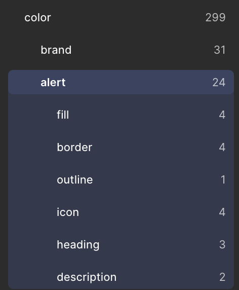
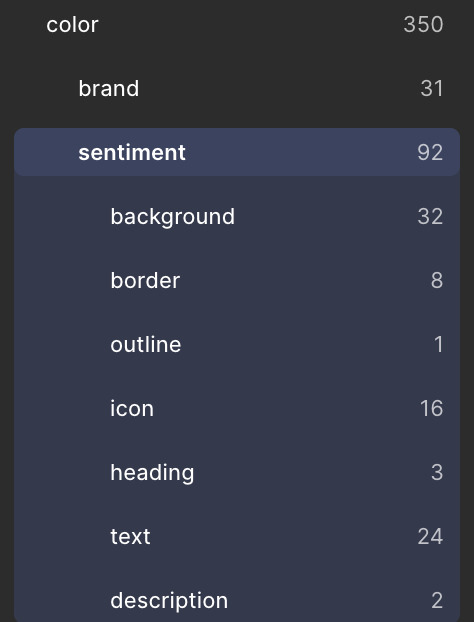
The ramps started as Figma variables during testing, then moved into Tokens Studio, which pushes them to the repo and the tokens pipeline. I re-architected the structure: a new ATH-Primitives collection holds the ramp values, and a new color/sentiment group in the Brand collection references them, replacing the direct hex values in color/alert.
Mapping the new variables to components is a breaking change, so I copied the component library into a new major version. The old and new groups coexist, so teams can migrate on their own schedule.
Solution
- 10
- 20
- 30
- 40
- 50
- 60
- 70
- 80
- 90
- 100
Results
- Full ramps in place of a 6-token setup: Four 10-step ramps (
info,success,caution, anderror) replace three base colors with three highlights, withcautionas a new hue.color/sentimentholds 92 variables against 24 incolor/alert. - Accessible combinations built in: Within each ramp, about 20 of 45 possible step pairings reach 4.5:1 and 13 reach 7:1 under WCAG, and every documented pairing passed WCAG 2.1 and APCA across the base and task surfaces in light and dark.
- More component range: Six component sets were remapped, around 66 variants in total including the new dark-mode variants, with optional inverse variants, interaction-state variables, and higher and lower contrast options for icons and text.
The new library hasn't been released yet, so adoption is the next measure, and no deprecation date has been set for color/alert. I documented how to create new ramps with the tools I built, so the system can grow without me. Likely next are ramps for data visualization and AI branding, and theme-specific alternatives where a sentiment hue sits too close to a brand accent, such as a yellow caution in place of the orange.
Reflection
What I'd Refine Further
I'd pair more closely with the designer who built the primary, neutral, and accent ramps. Those were finished and approved before my work, and they weren't made with a systematic process. When I pulled their lightness, chroma, and hue curves and applied them to the new sentiment hues, the results didn't give me the range of accessible combinations I wanted, so I had to build the curves myself. Working together earlier would have meant one shared approach across every ramp in the system.
In my own ramps, I'd refine the dark end. The 100 steps are very dark, and they likely won't get much use.